Via Ferrata Photoshop Advertising
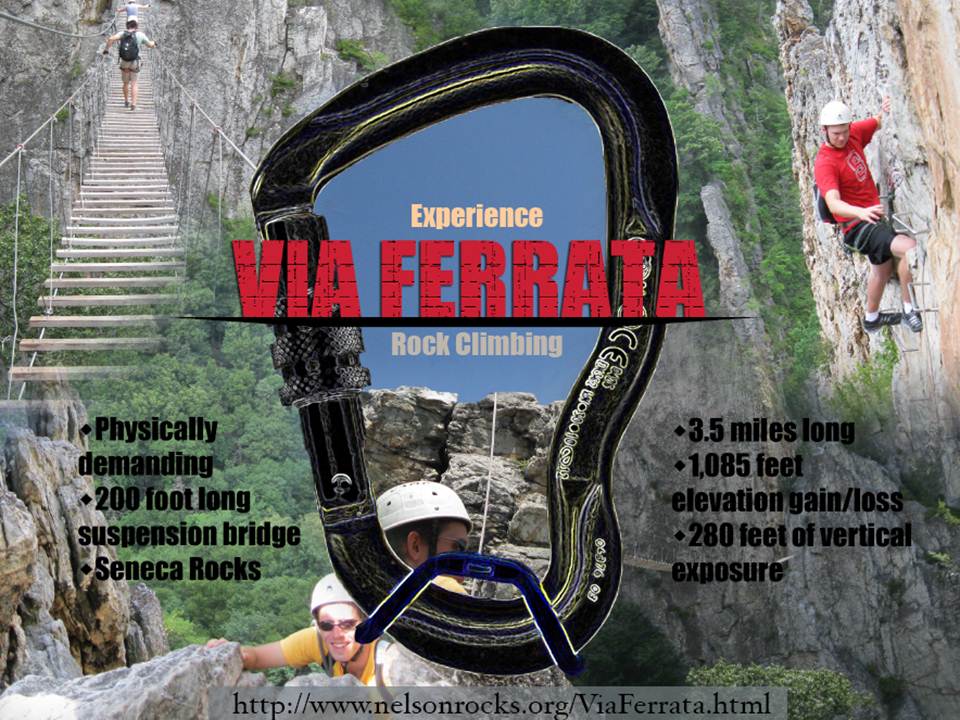
Several design concepts were used within the Via Ferrata advertisement. To create a strong center of interest, the title uses a strong contrast of bold primary colors, (red and blue) to create emphasis in conjunction with a contrasting font texture. “VIA FERRATA” is even underlined to signify its importance. Also, because of the prominence of the climbing karabiner, the eye is naturally drawn towards its center. The other surrounding font colors of “Experience” and “Rock Climbing” were chosen to be less intense such that they did not visually compete with the primary focal point. Throughout the rest of the work, repetition of font is used to create a sense of unity, as well as equal visual weight. All text follows a formal symmetrical balance scheme for this reason. The secondary focal points are the top left and right climbing photos. This provides the reader with a visual understanding of what the “Via Ferrata” really is. The tertiary focal points are the two black bulleted lists on either side of the karabiner, providing the audience with a more comprehensive written description of what the Via Ferrata includes. A low contrast black was used for this text because I wanted the viewer’s attention to be drawn towards the upper pictures before reading about it. Finally, after gaining a visual and written understanding, the viewer’s eyes drift to the bottom of the page to discover the Via Ferrata website, along with the lower pictures located in the bottom left and right corners. Also, all geometric shape and text colors conform with the composition because they are all replicated from background images.
Leave a Reply